But... no.
Give me a bulletin board though, and I can figure out all sorts of layouts and designs. Suggest a theme and I will happily find or create some trim and anchor elements that will grab my students' attention and make them excited to create and share with all who might visit our hallway.
Apparently bigger is better for me.
*****
Artistry and layering know-how aside, there are rules regarding bulletin board displays, and these rules differ by district, school, and by fire marshal. I've worked at a school that allowed teachers to cover every bit of staple board (as well as the classroom door and windows) with butcher paper before layering on trimmers, frames, and other design elements, and I've taught in a district that didn't allow any signs, mobiles or wall decor to be hung anywhere except on the one awkwardly placed bulletin board in the classroom. It was also expected that emergency procedures, standards and our daily schedule would be displayed on the board before any student artwork could be featured.
Before tacking a single item to a wall or board, ask your colleagues or principal what limitations, rules, or policies are in place.
Rules change too. When I began teaching at my current school, I would wheel the butcher paper cart down the hallway at the beginning of each school year and cover the hallway boards as well as many of the ones within my classroom. Two years later, a new fire marshal determined that hallway boards and walls could only have twenty percent-ish of their surfaces covered by student artwork and displays, a tough rule considering that elementary students tend to work in 9 X 12 or 9 X 18 construction paper scale. Complying with safety standards, gone are the days of carefully selecting the perfect background color for a year's worth of bulletin board artistry. But there's an upshot: time is precious for teachers, and for those of us who are too Type A to allow anyone else to manage our boards, a simple system or template works wonders.
Determine which boards or surfaces will house anchor elements such as the alphabet, number line, word wall, calendar (if you're not using an interactive whiteboard) year 'round. Within my classroom, I've used black butcher paper for the background of my students' word wall, but simply trimmed other long-term elements with coordinating border. I then decided where regularly rotated display areas could exist. Artwork and projects can be tacked to staple boards, but they can also be mounted onto walls, closet/cabinetry doors, or (if allowed) hung from the ceiling.
Using coordinating trim throughout the room helps to create visual borders for learning areas and displays. I've left two areas paper and border-free though, because I would like the option of using some holiday/seasonally matched trimmer if the mood strikes during the year: the board above my sink, near the painting and play dough center, and near the calendar and class library area, where literacy-related artwork can compliment the decor.
See the bare board near the window (it's partially obscured by a magnet board and set of trays at the moment)?
Here's the board above the sink. I bet you can guess what one of our first art projects will be:
I promise I'll give you a photo-tour of the layout before I'm back to work full time, but until then, let's check out the simple hallway display... and when I say it's ~simple~, I mean it's **simple**.
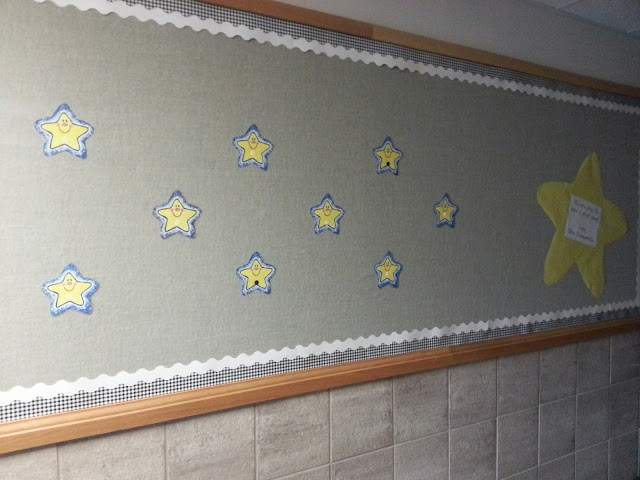
How can a nervous kindergartner orient himself/herself while learning how to navigate the hallways? By finding a recognizable symbol, a super star:
Our hallway is shared with kindergarten, first, and second grade classrooms, so there are bound to be many colorful and engaging displays welcoming students on the first day of school. I simply want our classroom's location to be easy to spot or describe to others if lost.
I first found a cute clip art star online and enlarged it on my SMART Board (locking the image in place helps) and traced it onto yellow butcher paper:
I printed out "Twinkle, twinkle little Stars, I wished for you and here you are" and "We are going to have a great year! Love, Mrs. Sommerville," and added the text to each star.
The boards are trimmed with solid white and black and white gingham, a combination that worked well last year.
It's ~very~ plain, and I understand that it might not appeal to many adults who prefer layers upon layers of scrapbooking-type magic, but its primary purpose the first week of school is to mark our area, our actual physical location for my students. Considering that one of our first big projects is self-portraiture, I also don't want to put a lot of time and energy into the hallway display just to take it all down five days later to prep it for actual student artwork. Saving time during board swap-outs is an essential teacher trick for working efficiently and keeping your weekends for yourself and your family.
*****
Need some bulletin board inspiration? Check out Pinterest!


No comments:
Post a Comment
As always, thank you for your comments, tips, suggestions and questions!