Maybe you'll be changing grades, buildings, or even districts, or you'll be staying right where you are, but you want to freshen things up a bit. Perhaps your school is being renovated requiring a temporary move to another room with an expected mid-year return to your original once improvements are complete. Possibly you've been told that a student requires room modifications to allow wheelchair access, a visually calmer environment for behavior management, or frankly you're just not pleased with how a center was underutilized during the previous year.
Change happens.
Like many of you I've loved the eye candy and visually inspiring pins to be found on many teachers' Pinterest boards and pages. Ideas for storage and organization, bulletin boards, guided reading, instruction via manipulatives, links to TpT products, and colorful art projects have all found themselves re-pinned by yours truly onto my own "Teacher Tips" and "Cute Crafts for Kiddos" boards. But when it comes to classroom decor, my professional bias prevents me from pinning much of what I find on Pinterest or kindergarten blogs.
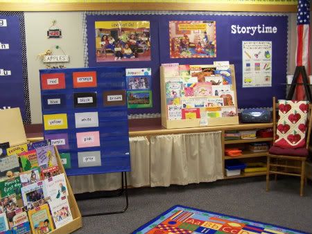
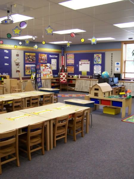
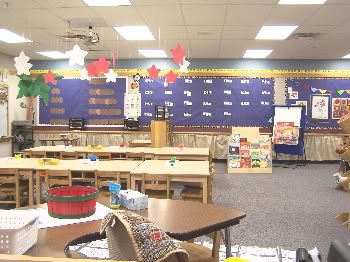
You've seen my classroom over the years:


Bright yet unifying color on the wall, display and learning areas labeled, lower shelf storage covered by neutral curtains on tension rods, and decor that changes each month to accommodate concepts, themes, and seasons:
Though anchor charts, student artwork and theme displays change throughout the year, their general locations and unifying backgrounds do not, which becomes an expected visual template that my Super Stars utilize. Math concepts and work can be found in our math corner which contains a learning center, bulletin board display and manipulatives. Our word wall is a dominant feature of the room, and patterning/sorting/classifying elements (or student artwork) are displayed above the students' desks.

Now imagine my room if we added multiple borders of polka dots, neon animal stripes, feathered boas (don't worry, I love Fancy Nancy too) seven different patterns of fabric for wall displays, seating cushions, beanbags and seat sacks, a word wall backed by twenty-six different pieces of scrapbook paper and my shelves full of supplies (in clear tubs) were uncovered. For a final touch, imagine all of these displays in a room half the size of mine, with floor to ceiling staple boards, every inch of them covered.
Ouch.
I understand wanting to have an inviting, educational, visually appealing and inspiring classroom. I appreciate textural elements and the use of color, but: too much of a good thing is ~not~ a good thing when it comes to setting the tone, feel, and efficacy of a kindergarten classroom. Sure, polka dots and neon animal stripes are cute, and I certainly indulge in my own match-y match-yness as I create center tags, utilize pocket charts and select trim for my boards, but there comes a point when the cutesy factor competes for attention with the concepts being taught, and *that*, my dears, is when the line has been crossed.
Your Poem of the Week chart is awfully cute with three different layers of colored/patterned borders, and you've used an additional textural element on top of that (oh, the boas are big this year according to Pinterest), but now your math display isn't as "eye-catching," so you're having to add a row of jingle bells onto your pointer for students to use as they work with the 100 chart. Oh wait, now THAT's too distracting and students find the book center "boring" because you didn't create four stand-up Chicka Chicka Boom Boom trees surrounded by beanbag chairs that you turned into "coconuts" by purchasing brown fabric with which to cover them.
Congratulations, you're stuck in the gimmick that has become your students' learning environment and it's my guess that your students are expecting their room to be more entertaining than experiential.
Your classroom is a place for all students, even the easily over-stimulated or distractible ones, to feel welcome, safe, and engaged. Accosting their visual, auditory, even olfactory senses because you've decided that your classroom should look like a child's birthday theme party on steroids isn't appropriate, no matter how cute you think it might be. How many boys want to be surrounded for nine or ten months by Fancy Nancy? Girls Ninjago?
B-a-l-a-n-c-e dear colleagues, balance. You were provided with a classroom not for the purpose of indulging your inner Decor-Fairy, but to educate, enable, and facilitate your students' learning. Their academic, behavioral and social needs come before yours.
*****
In case you're worried, I'm no boa-hater. I find a green one essential every March.

What a thoughtful entry. I remember when I first started teaching, over 30 years ago, that bulletin boards were all the thing. We even had a bulletin board class in undergraduate school! They had to be interactive, visually appealing, and change each month (inside the class and in the hall). They took HOURS of planning and creating only to have the kids zip through them in a matter of minutes. I remember thinking at the time "What a huge waste of my time".
ReplyDeleteOver the years I've streamlined my class. I too have a basic unifying color scheme and change my centers monthly or with the learning theme. I wonder about some of the rooms I see. Do they belong exclusively to the teacher or are they "our" room?
Thank you, I always find your posts very interesting.
Cindy in WA
well said, and you have such a great point. I, too, love to decorate (not over-do-it), as I teacher special needs students in my regular kindergarten classroom environment. I have to keep in mind those students who are over-stimulated and who can become distracted my too much. Somewhere I read that you should stick to 3 basic colors. Hopefully, I will be able to accomplish this. I do not go overboard, as in having to make sure all my containers match, etc. That is way too expensive to change each year, so I make do with that I have :) Thank you for going out on a limb to help remind us of what is really important - the CONTENT!!! :)
ReplyDelete~ Kimberlee ~
Two Fulbright Hugs
Teacher TimeSavers
You are so right about keeping balance.
ReplyDeleteLorena
I have been wondering if I was the outcast on these blogs because I am not a cutesy teacher! You said it so well! I love to have an organized, inviting room with nice looking things but I also believe that it needs to be suitable for learning and when there are patterned papers and polka dots everywhere it is visually overstimulating for our students! No offense to those who like cutesy things, there is a place for it. I think we get caught up in the fun things that we find on pin boards and we can get carried away. Thanks for reminding us to take a step back and not cross the line!
ReplyDeleteWhat I Learned in Kindergarten
I think one of the most important things that I learned in college was to make the classroom ours. So my bulletin boards are bare at the start of the year, until my students make something to fill them up. There are no cute little cubby theme names put on mailboxes or lockers until after the first few days. I always use the children's pictures and I take those on the first day. Name tags are on colored card stock and the only decorative piece is the door with a "cutesy" name displayed welcoming my new charges to our room. Although I teach with a thematic approach I don't change every item in all my centers to that theme, here and there are always some subtle changes but nothing too drastic. I am always curious where the teachers who come up with the differing games/activities on every theme store all of those things. Thanks for reaffirming some of what I believe to be appropriate for my young students.
ReplyDeleteThanks for this post! I had been thinking the exact same thing as I peruse the pinterest classrooms. I even stumbled across a blog of a teacher who has quit teaching to work on her business of "staging" classrooms! What???! Why on earth are we "staging" classrooms? While I enjoy preparing my classroom for each new year, I am focused on the functionality of the space more than the decor.
ReplyDeleteI loved this post! I love reading all of your posts... which is why I've nominated you for an award! Stop by my blog to get the details!
ReplyDeleteJennifer
Teaching with Grace
I love, love , love this post! Oh how many days last year did i wonder... "Am I doing something wrong by not making my door cute enough, or using a theme all year long in my room? Thank you reverberating what is most important teaching the kids! ( not that my room is boring, but if I did what some of my colleagues did I would have some of my kids hangin' from the rafters and complete chaos. )
ReplyDeleteThis and all the posts I've read before this one are wonderful. I love your blog. I haven't found one thing I disagree on. I'm so glad I found you and look forward to more "rants"!
ReplyDeleteJenny
Owl Things First
Our school is actually going in the opposite direction with the Reggio approach- no "teacher store bought" theme stuff allowed in kindergarten! We have cleared our classrooms of color we put neutral burlap and brown kraft paper on our bulletin boards. i wasn't so sure at first, but I an really liking it as we get it together. It is a very calming atmosphere...
ReplyDeleteI ~love~ the Reggio Emilia approach- its use of natural elements and recognition and acceptance of family, teachers, children themselves and the environment as partners in the learning process speaks to my soul. It's360 degrees of true collaboration, supporting the process instead of merely focusing on the product.
ReplyDeleteI would love to see your classroom! Thanks for visiting.
Michaele
One of the many reasons I like being a "Special" teacher. Music teachers don't have to change a thing year to year! I actually might make one bulletin board this year, but that's only because we are doing "Music Olympics" at the beginning of the year... shhhhh! Don't tell anyone!
ReplyDeleteI will be the one who does a little push-back, and I say this as someone who loves your blog, loves your classroom, and loves it when you do a little rant. Your rants are always very thoughtful and intelligent, and I admire opinionated women.
ReplyDeleteI agree with you that a room should not be overwhelming, and that cute does not come before content. However, I love looking at ideas for classroom decor on Pinterest, and think that a lot of what I've seen is actually really fun and appealing and attractive.
I think that a visually appealing room can instill pride in the teacher, and a sense of wonder and community in the kids. And...I would note that some people might think that all of your tchotchkes are...well...cute.